

Behavior Design in AI #1: When the Interface Is the Response
A new series exploring the design decisions between you and AI. One signal at a time.


What if the app you opened tomorrow looked nothing like the app you opened today, and that was the point?
Not a redesign. Not an A/B test. A completely different interface, generated on the fly, based on what the AI thinks you need right now.
That’s the idea behind generative UI. And it’s already shipping.
A quick evolution to show you how we got here. Think about how search has changed your relationship with answers. Ten years ago, you Googled a question and got ten blue links. You clicked around, read three articles, maybe opened a YouTube video, and pieced together your own understanding. You did the synthesis.
Then search started pulling content into the page itself. Featured snippets. Knowledge panels. Video carousels. Google was doing more of the assembly for you, but you were still navigating between content types and deciding what mattered.
Then came AI Overviews. Now the search engine reads the sources and hands you a synthesized text answer. A lot of people stopped clicking through entirely.
And now there’s a next step that changes the shape of this again. Google’s Gemini app has an experimental feature called Dynamic View. You give it a prompt and instead of returning text or even a summary, it builds you an interactive tool.
Here’s what happened when I tried it. I asked Gemini to compare renting versus buying a home in Westchester County on a $500K budget over 10 years. It didn’t send me to a mortgage calculator site. It didn’t summarize articles about the housing market. It built me a custom financial calculator with adjustable sliders for home price, interest rate, and monthly rent. A 10-year comparison graph. A cost breakdown table. Neighborhood photos. A tool, made for my question, that I could adjust and explore.
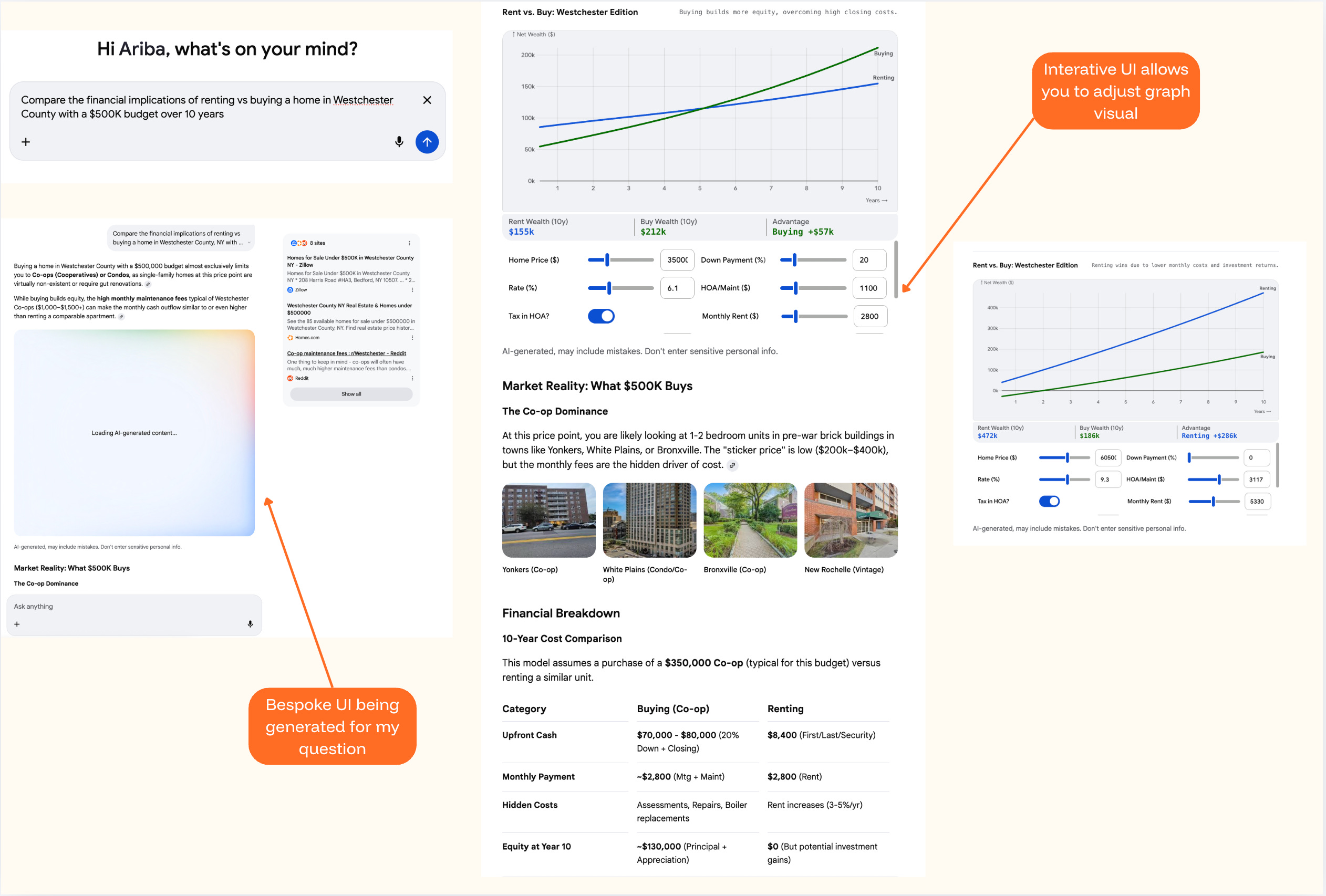
Google published a research paper alongside the launch. Human raters strongly preferred these generated interfaces over standard text. That tracks. A calculator you can adjust is more useful than three paragraphs walking you through the math.
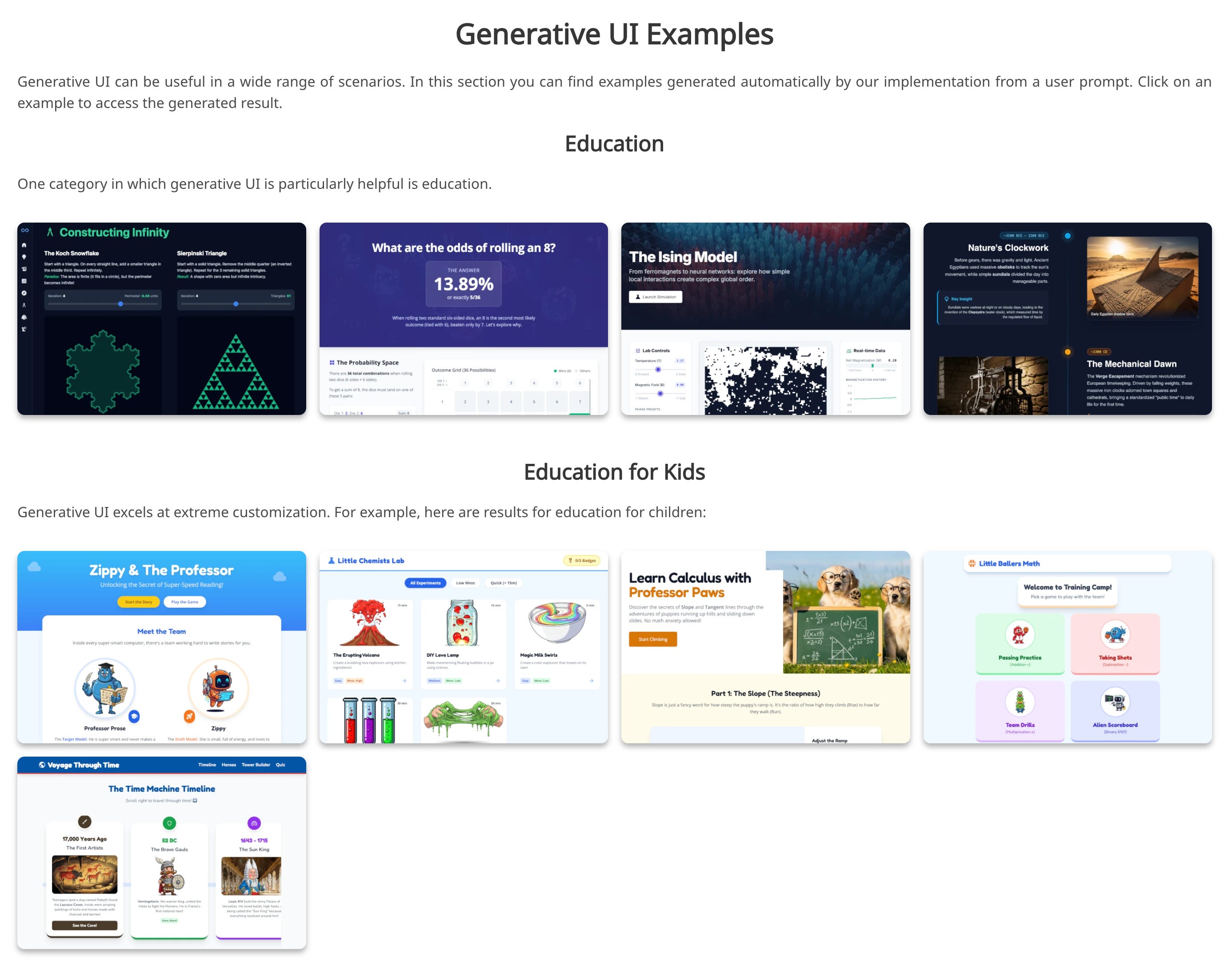
And Google’s project page shows this working across a surprising range of prompts. Educational tools for learning about fractals. Interactive fashion advisors. A probability visualizer for rolling dice. A Thanksgiving hosting planner. Even games. All generated from scratch, on the fly, for a single prompt.
What’s interesting is how Google chose to contain it. The Gemini interface itself doesn’t change. The chat stays the same. The navigation stays the same. The generated tool appears inside the response area, like a card you can expand and interact with. You’re not disoriented because the frame is familiar. Only the content inside the frame is new.
That’s a design decision worth noticing, because it’s doing something careful. It draws a line: the shell stays, the response transforms. And within that constraint, it actually works. I was genuinely impressed by what it generated for me. The question I keep sitting with is how far this gets pushed before it stops feeling this seamless.
Because the more ambitious versions of this go a lot further. Nielsen Norman Group published a framework for what they’re calling “outcome-oriented design.” In their vision, designers stop designing specific interfaces altogether and start designing outcomes, constraints, and guardrails for AI to work within. Their example: imagine a Delta Airlines app that knows you have dyslexia (special fonts), always want window seats (flagged automatically), care most about cost and travel time (shown prominently), and never take red-eyes (collapsed to the bottom). Every element of the page shaped to one person.
There's a real accessibility promise in that vision too, interfaces that adapt to how someone actually needs to receive information. That alone makes it worth taking seriously.

That’s not a generated card inside a stable chat window. That’s the entire app reshaping itself around you. And the developer ecosystem is building toward it. Tools like CopilotKit and Vercel’s v0 are creating infrastructure so any product can generate UI on the fly. Flutter released an SDK. The idea that AI should generate not just content but the container the content lives in is picking up speed.
I can see why it’s compelling. Right now, almost every SaaS dashboard, every settings page, every search result page looks roughly the same. A bar chart might be the right format for one answer and an interactive timeline might be right for another, but when you’re designing one interface for millions of people, you pick a pattern and ship it. There's something in common here with vibe coding, the practice of describing what you want in plain language and letting AI build it for you. Same impulse: describe what you want, AI builds it. Same open question: when everyone generates from the same models, do you get more diversity in what’s built? Or more sameness with a slightly different coat of paint?
This is where it gets complicated though. When a blog post about generative UI hit the Hacker News front page, the developer community pushed back hard. The most upvoted comment: “Personalized interfaces are bad. I don’t want anything automatically configured on my behalf. I want it to just work.” Someone brought up Microsoft’s adaptive menus from the early 2000s, the ones that reordered items based on what you used most. Everyone hated them. They were killed.
The practical concerns are real. If every user sees a different interface, how does a coworker show you how to do something? How does support reproduce your bug? How do you write documentation for software that looks different every time someone opens it?
And there’s a deeper question in there too. Most of the trust I have in the products I use comes from the fact that they stay the same. I know where the button is. I know what happens when I tap it. That familiarity is built over dozens of uses, and it’s what makes me confident enough to rely on the product for something that matters.
Google’s version works partly because it respects this. The generated UI is a tool within a conversation, not a replacement for the whole app. But the NN/g vision? Where the entire interface reshapes itself every time? That asks you to trust an AI to know what you need better than a fixed interface that you’ve already learned. And I’m not sure most people are ready for that trade, even if the generated version is technically better on first use.
But I don’t think the skeptics have the full picture either. The argument that users should just learn the software assumes the software was designed to be learned by them in the first place. Most of it wasn’t. It was designed for a general user and everyone else adapted. The reason millions of people ask ChatGPT to write them an Excel formula isn’t laziness. It’s that Excel was never built for how they think about the problem.
There might be a middle version that’s more interesting than either extreme. Not an interface that rebuilds itself from scratch every time, but one where certain elements adapt while the structure stays fixed. Navigation stays predictable. Core actions stay in the same place. But the content, the defaults, the level of detail, the specific options surfaced? Those shift based on what the system knows about you. Keep the parts people reach for and creates expectations. Generate the parts people read, bespoke to what they’re looking for.
Nobody’s really building that version yet. Google went maximalist with full code generation and disposable interfaces. The developer ecosystem is more conservative, building pre-tested components that AI assembles based on context. NN/g is imagining a future where designers design outcomes, not screens. Three different bets on where the line belongs between what changes and what holds still.
I don’t know which approach wins. But I think the interesting design question isn’t whether interfaces should adapt. It’s how much of the interface is allowed to change before it stops feeling like the same product. Google drew one line. The rest of the industry is still figuring out where theirs goes.
Generative UI is a genuinely cool capability. What I want to keep paying attention to is who decides what changes, what stays fixed, and whether the user ever gets a say in that.
I’m going to keep watching this one.
Behavior Design in AI explores the design decisions between you and AI. One signal at a time. Subscribe to catch the next one.
Sources and further reading:
Google Research: Generative UI paper and project page
Google Generative UI demos and examples
Nielsen Norman Group: Generative UI and Outcome-Oriented Design
Hacker News discussion on generative UI
As a gal who thrives on structure and familiar systems, my instinct is to assume I’d prefer Gemini’s contained approach (stable shell, dynamic response)...or maybe the thoughtful middle ground you touched on. But I wonder if that’s shortsighted.
Are there real-world examples of “outcome-oriented design” at scale today? Or is this still largely a conceptual framework? I’m super intrigued by the accessibility implications, if designed responsibly.
I’m also curious how GUI might translate to media or social platforms...if interfaces reshape themselves around individual preferences, do we risk deepening echo chambers and accelerating misinformation? Or is there a version of this that meaningfully broadens perspective instead of narrowing it?
This sparked so many thoughts and questions for me!! Thank you for the thoughtful observation, Ariba 👏🏼
At what point does personalized pages where each person gets their own experience becomes creepy? To your point in establishing trust, what does this do to overall brand trust if everyone's going to have a different experience?